API examples
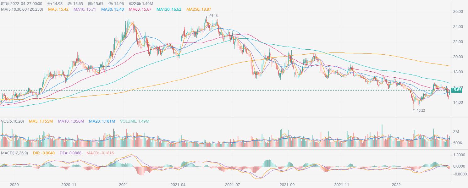
KLineChart chart
from chartspy import KlineCharts
import tushare as ts
df=ts.pro_bar(ts_code="000001.SZ",adj='qfq')
df.rename(columns={'trade_date':'timestamp','vol':'volume'},inplace=True)
KlineCharts(df, main_indicators=['MA', 'SAR'], mas=[5, 10, 30, 60, 120, 250])
chartspy.express
from stocksdk import api
import pandas as pd
import numpy as np
import chartspy.express as ex
from chartspy import Tools, Echarts, G2PLOT, Js
import datetime as dt
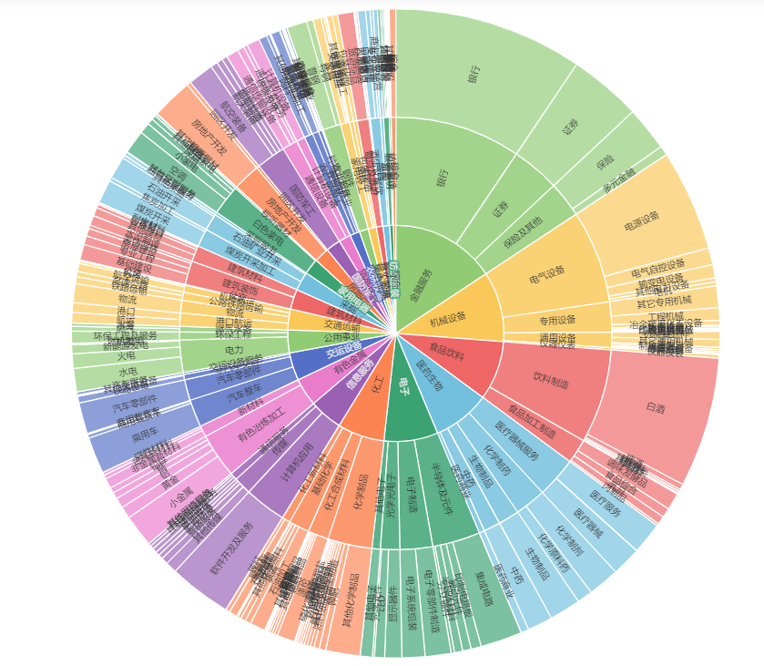
df = api.last_info_all()
df1 = df[['同花顺1级', '同花顺2级', '同花顺3级', 'name', '流通市值']].dropna()
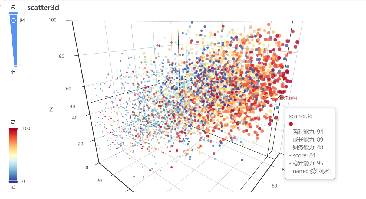
df_score = df[['盈利能力', '成长能力', '财务能力', 'score', '稳定能力', 'name']].dropna(
subset=['盈利能力', '成长能力', '财务能力', 'score', '稳定能力'])
ex.scatter3d_echarts(df_score, x_series='盈利能力', y_series='成长能力', z_series='财务能力', size_series='score',
color_series='稳定能力',
info='name',
title='scatter3d')
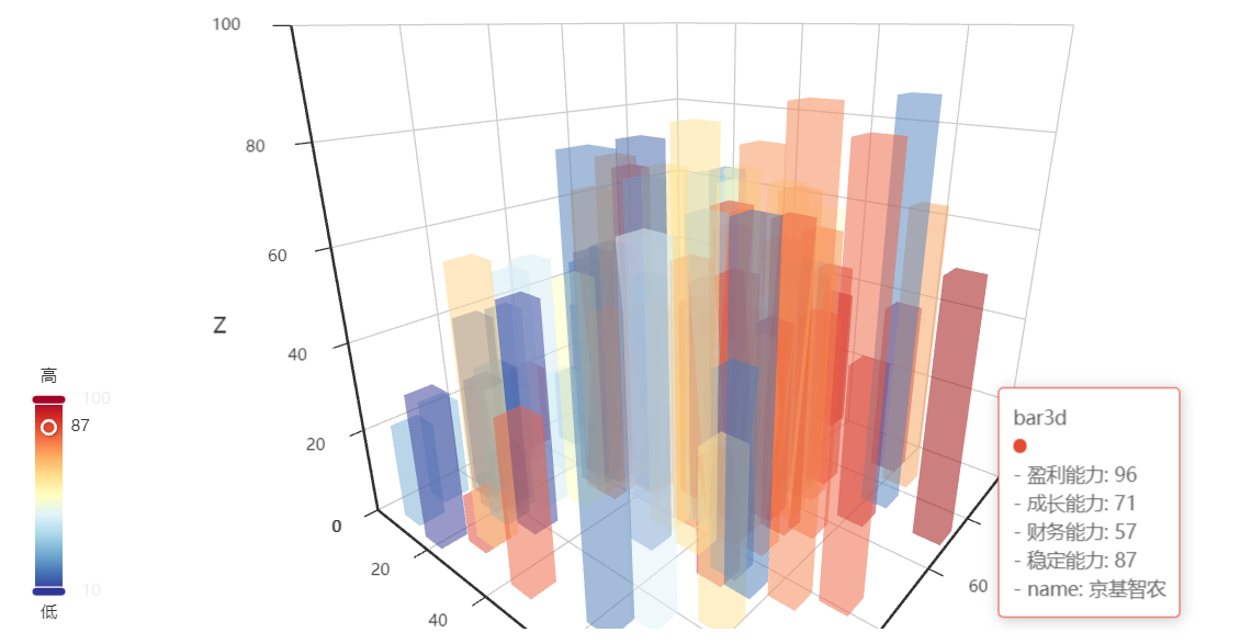
ex.bar3d_echarts(df_score.iloc[0:100], x_series='盈利能力', y_series='成长能力', z_series='财务能力', color_series='稳定能力',
                 info='name',
                 title='bar3d')
ex.sunburst_echarts(df1, category_series_list=['同花顺1级', '同花顺2级', '同花顺3级'], value_series='流通市值', height='600px')
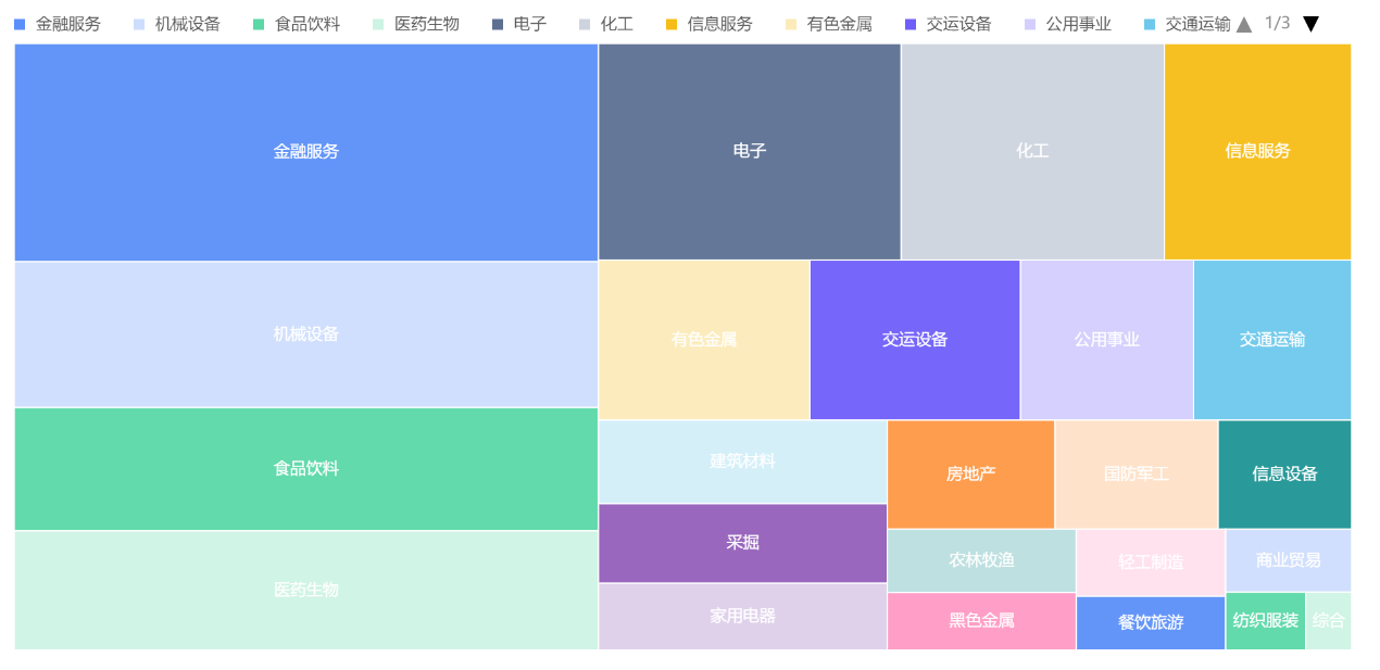
ex.treemap_g2plot(df1, category_field_list=['同花顺1级', '同花顺2级', '同花顺3级', 'name'], value_field='流通市值')
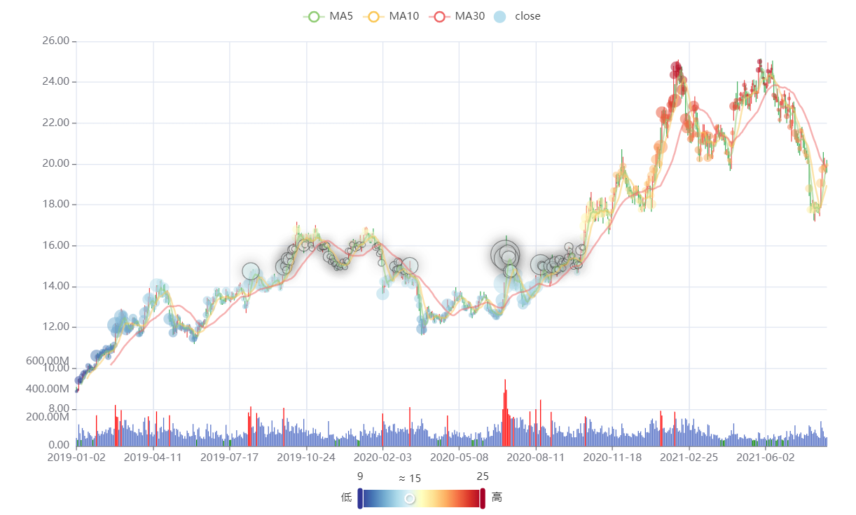
df_price = api.get_price('000001.XSHE', start_time=dt.datetime(2019, 1, 1))
chart_kline = ex.candlestick_echarts(df_price, log_y=False)
chart_kline.overlap_series([ex.scatter_echarts(df_price, y_series='close', size_series='volume', color_series='close')])
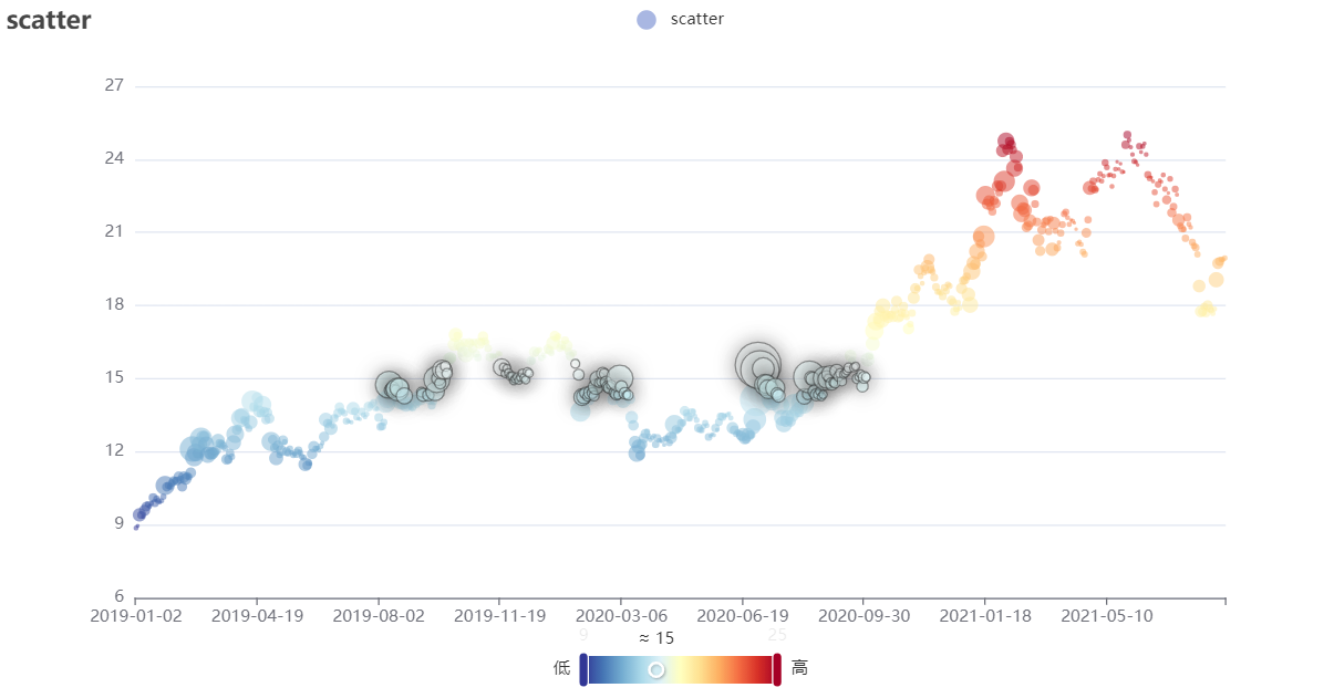
ex.scatter_echarts(df_price, y_series='close', size_series='volume', color_series='close', title='scatter')
ex.line_echarts(df_price, y_series='close').overlap_series(
    [
        ex.line_echarts(df_price, y_field='open'),
        ex.line_echarts(df_price, y_field='high'),
        ex.line_echarts(df_price, y_field='low'),
    ]
)

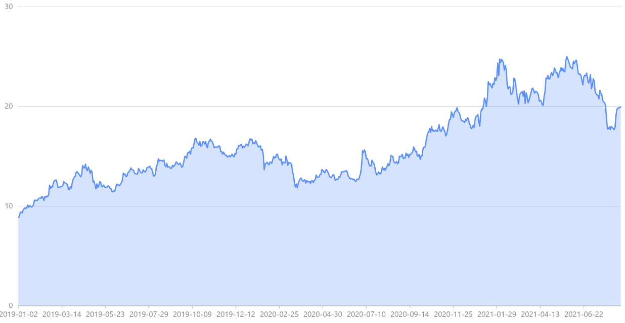
ex.area_g2plot(df_price.reset_index(),x_field='index',y_field='close')
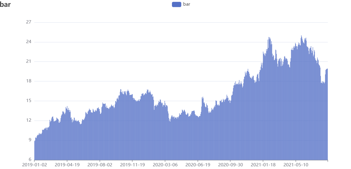
ex.bar_echarts(df_price, y_series='close', title='bar')
ex.bullet_g2plot(title='子弹图',range_field=[40,60,80,100],measure_field=[90],target_field=100,height='60px')

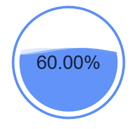
ex.liquid_g2plot(percent=0.6)
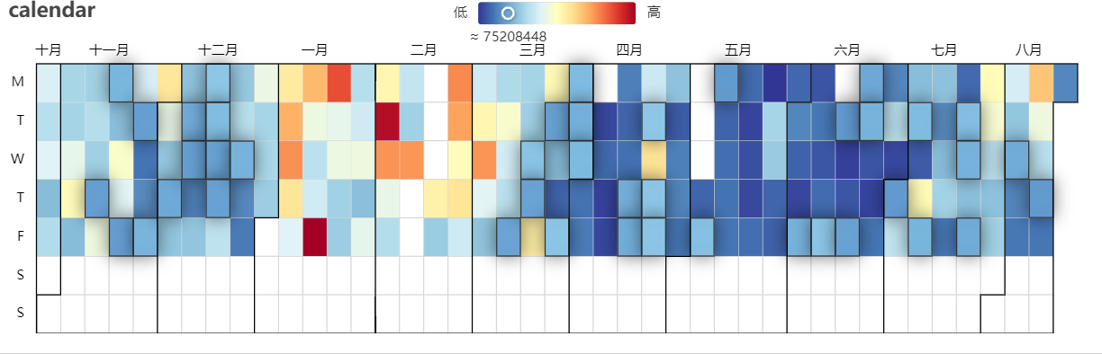
ex.calendar_heatmap_echarts(df_price.reset_index().iloc[-200:], date_series='index', value_series='volume',
                            title='calendar')
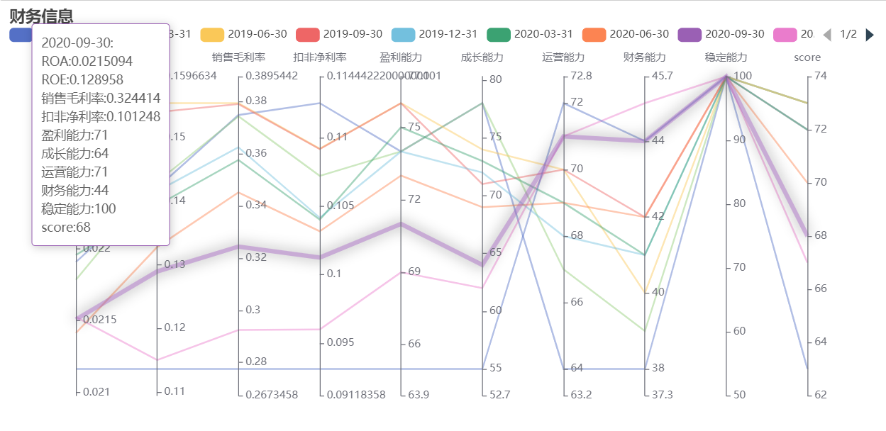
df_finance = api.filter_table("财务打分", code='000002.XSHE')
ex.parallel_echarts(df_finance.iloc[-10:], name_series='statDate', indicator_series_list=['ROA',
                                                                                          'ROE', '销售毛利率', '扣非净利率',
                                                                                          '盈利能力',
                                                                                          '成长能力', '运营能力', '财务能力',
                                                                                          '稳定能力',
                                                                                          'score'], title='财务信息')
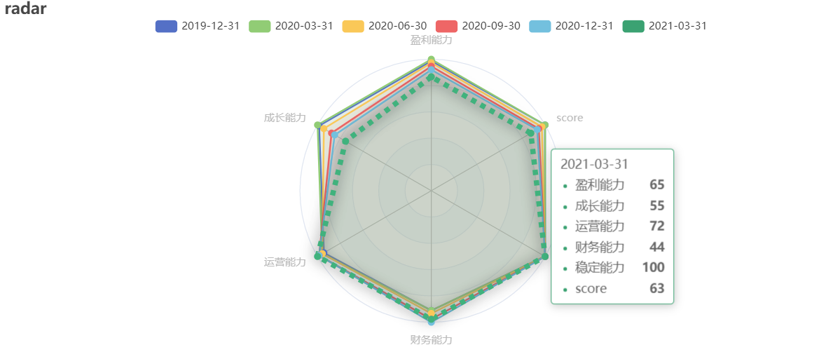
ex.radar_echarts(df_finance.iloc[-6:], name_series='statDate', fill=True,
                 indicator_field_list=['盈利能力', '成长能力', '运营能力', '财务能力', '稳定能力', 'score'], title="radar", height='400px')
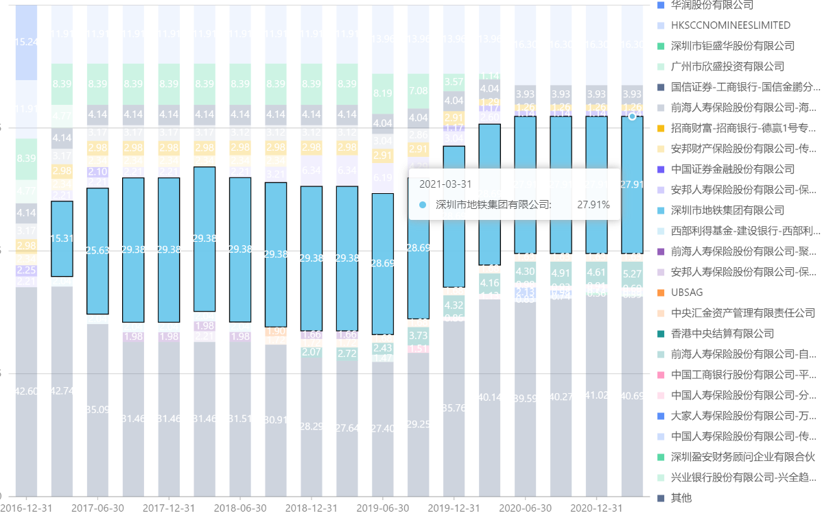
df_top10 = api.filter_table("十大流通股东",code='000002.XSHE')
df_top10['持股比例']=df_top10['持股比例'].round(2)
df_other=100-df_top10[['报告期','持股比例']].groupby("报告期").sum()
df_other['股东名称']="其他"
df_all= pd.concat([df_top10[['报告期','持股比例','股东名称']],df_other.reset_index()])
ex.bar_stack_percent_g2plot(df_all,x_field='报告期',y_field="持股比例",series_field='股东名称',height='600px')
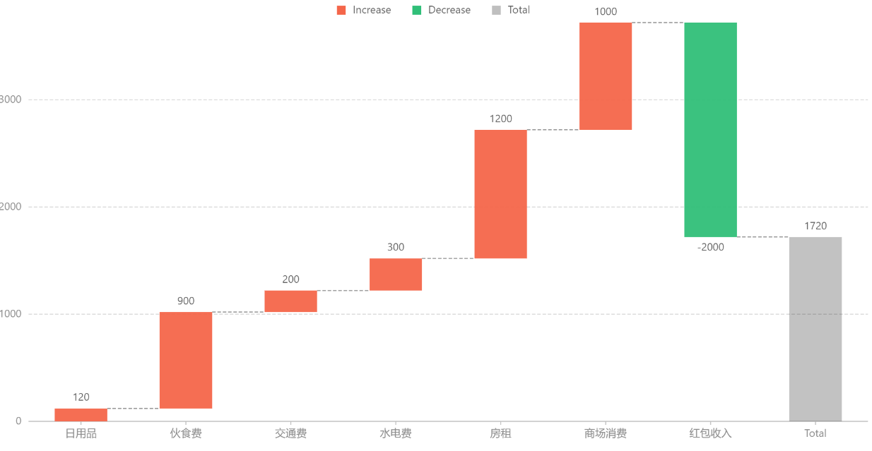
df_waterfall=pd.DataFrame([
  { 'type': '日用品', 'money': 120 },
  { 'type': '伙食费', 'money': 900 },
  { 'type': '交通费', 'money': 200 },
  { 'type': '水电费', 'money': 300 },
  { 'type': '房租', 'money': 1200 },
  { 'type': '商场消费', 'money': 1000 },
  { 'type': '红包收入', 'money': -2000 },
])
ex.waterfall_g2plot(df_waterfall,x_field='type',y_field='money')
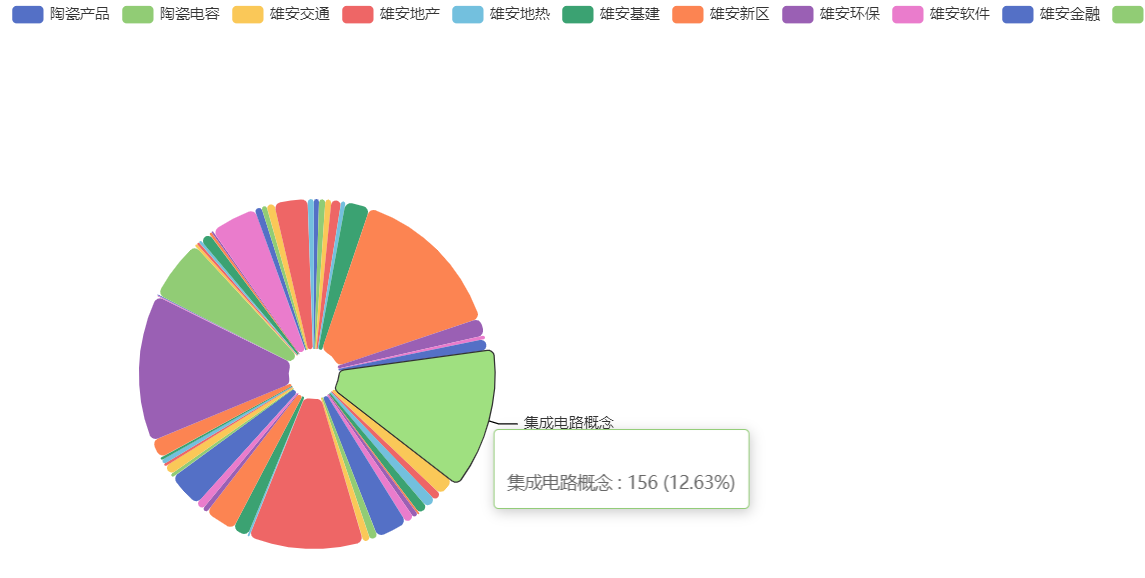
df_concept= api.get_concept().groupby('category').count()
ex.wordcloud_g2plot(df_concept.reset_index(),word_field='category',weight_field='code')

ex.pie_echarts(df_concept.reset_index().iloc[-50:], name_series='category', rose_type='none', value_series='code',
               height='600px', width='100%')
df_relation=pd.DataFrame(
[{ 'source': '北京', 'target': '天津', 'value': 30 },
  { 'source': '北京', 'target': '上海', 'value': 80 },
  { 'source': '北京', 'target': '河北', 'value': 46 },
  { 'source': '北京', 'target': '辽宁', 'value': 49 },
  { 'source': '北京', 'target': '黑龙江', 'value': 69 },
  { 'source': '北京', 'target': '吉林', 'value': 19 },
  { 'source': '天津', 'target': '河北', 'value': 62 },
  { 'source': '天津', 'target': '辽宁', 'value': 82 },
  { 'source': '天津', 'target': '上海', 'value': 16 },
  { 'source': '上海', 'target': '黑龙江', 'value': 16 },
  { 'source': '河北', 'target': '黑龙江', 'value': 76 },
  { 'source': '河北', 'target': '内蒙古', 'value': 24 },
  { 'source': '内蒙古', 'target': '北京', 'value': 32 }]
)
ex.chord_g2plot(df_relation,source_field='source',target_field='target',weight_field='value')

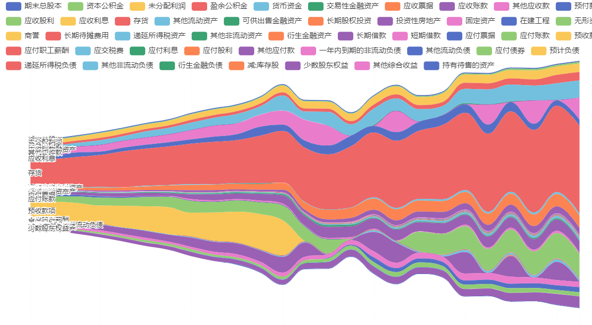
df_blance = api.filter_table('资产负债表', code='000002.XSHE')
df_cell = df_blance[['code', '报告期'] + list(df_blance.columns[6:])].melt(id_vars=['code', '报告期']).dropna(
    subset=['value'])
df_cell = df_cell[
    (df_cell['value'] > 0) & (df_cell['报告期'] > dt.datetime(2015, 1, 1)) & (~df_cell['variable'].str.contains("合计")) & (
        ~df_cell['variable'].str.contains("总计"))]
df_cell['value'] = (df_cell['value'] / 1000000000)
ex.theme_river_echarts(df_cell, date_series='报告期', value_series='value', theme_series='variable', height='600px')
Echarts object usage
accept python dict configuration,output charts
from chartspy import Echarts, Tools

options = {
    'xAxis': {},
    'yAxis': {},
    'series': [{
        'symbolSize': 20,
        'data': [
            [10.0, 8.04],
            [8.07, 6.95],
            [13.0, 7.58],
            [9.05, 8.81],
            [11.0, 8.33]
        ],
        'type': 'scatter'
    }]
}
Echarts(options, height='600px', title='散点图测试').render_notebook()
Tools static methods
javaScript config to python dict
from chartspy import Echarts, Tools

js_str = """
{
    title: {
        text: 'Male and female height and weight distribution',
        subtext: 'Data from: Heinz 2003'
    },
    grid: {
        left: '3%',
        right: '7%',
        bottom: '7%',
        containLabel: true
    },
    tooltip: {
        // trigger: 'axis',
        showDelay: 0,
    ......
}
"""
options = Tools.convert_js_to_dict(js_str, print_dict=False)
Echarts(options, height='600px').render_notebook()
DataFrame/Series/ndarray convert to list
import pandas as pd
from chartspy import Tools

df = pd.DataFrame(
    {
        '水果': ['苹果', '梨', '草莓', '香蕉'],
        '数量': [3, 2, 5, 4],
        '价格': [10, 9, 8, 5],
        '类别': ['硬', '硬', '软', '软']
    })
list_data = Tools.convert_to_list(df)
output:
[['苹果', 3, 10, '硬'], ['梨', 2, 9, '硬'], ['草莓', 5, 8, '软'], ['香蕉', 4, 5, '软']]